At SpeedX Marketing, we are a leading provider of innovative IT solutions tailored to meet your specific business needs. With years of expertise and a team of skilled professionals, we offer cutting-edge technology solutions that drive growth and efficiency.


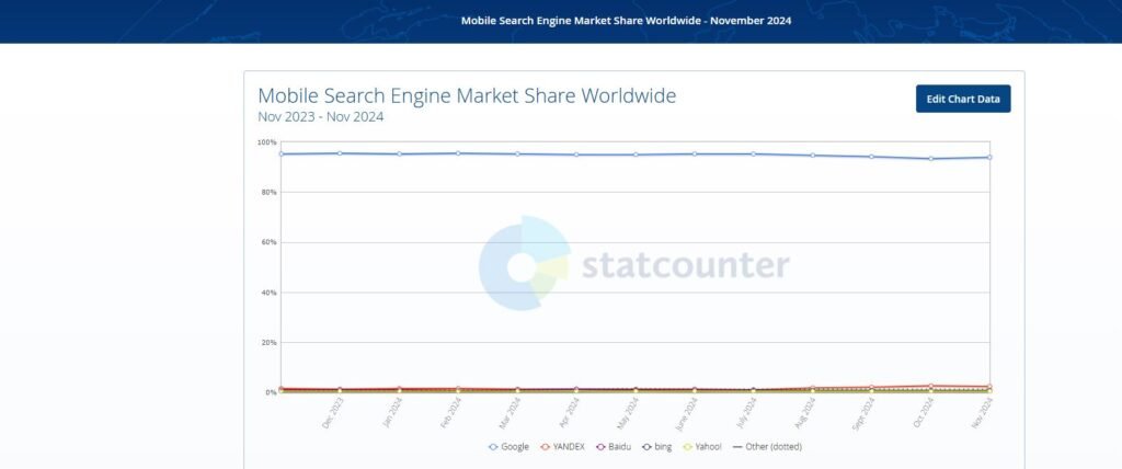
When we talk about mobile searches and website traffic from mobile devices, there’s one search engine that dominates the globe: Google. According to Stats Counter, 95% of the mobile searches are from Google.
And there are more searches on mobile than desktop. (Source: Search Engine Land). These statistics and facts emphasize that understanding the Google algorithms about mobile websites is crucial.
In this discussion, we delve into Google’s mobile search algorithms and updates exploring the factors that influence rankings, user experience expectations, and best practices to ensure visibility and competitiveness in the mobile search landscape.
In April 2015, Google rolled out a significant update that impacted how mobile users find information online. This update mentioned that Google will improve the ranking of mobile friendly web pages in mobile search results. And if your pages are not mobile friendly, your website traffic on mobile devices could decrease significantly. The update was for website individual pages not for the whole website. Despite the focus on mobile-friendliness, Google stated that various signals still play a role in ranking search results. User intent remains a critical factor, meaning that even pages lacking mobile-friendliness could rank high if they offer exceptional content relevant to the search query.
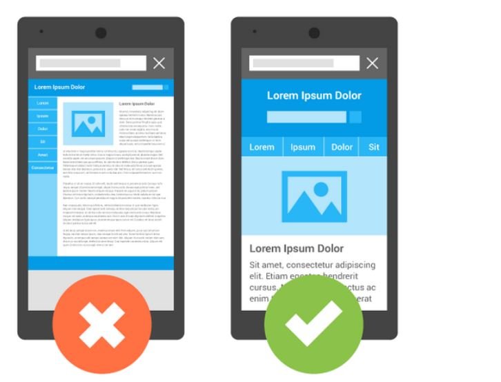
Picture Credit: Google Search Central
Google’s Mobile First Indexing primarily considers the mobile versions of a website’s pages to index and rank in search results. This update uses the mobile version of a website even if someone is searching from the desktop. Before this update, Google used to show mobile results to the mobile phone searches and desktop optimized results for desktop queries.
In 2016, Google announced a big shift in how it searches the web. Back then, most searches happened on desktops, but Google realized more and more people were using phones. The problem? Google judged websites based on their desktop versions, even if the mobile versions were different. This could mean missing important content!
To fix this, Google announced a move to “mobile-first indexing.” This meant they would start using the mobile versions of websites for ranking and searching, just like you see them on your phone. This was a big change for website owners, who now had to make sure their mobile sites were just as good as their desktop sites.
Fast forward to October 2023, and Google finally completed this move to mobile-first indexing! This means that now, for almost all websites, Google sees the web the same way you do on your phone. This is a big win for mobile users, who can be sure they’re getting the best possible search results.
Picture Credit: Mobile Search Central
The divergence of audience from the traditional desktop searches and Google Mobile Friendly updates has enhanced the importance of Mobile SEO more than ever. But before optimizing the websites for mobiles it’s important to differentiate the key differences between Mobile Search Results and Desktop Results . Although there are similarities in both mobile and desktop SEO practices such as responsive design, speed optimization and content management. And both involve optimizing your website to rank higher in search engine results, they cater to the different ways people search on mobile devices compared to desktops. Here’s a breakdown of the key differences:
Imagine looking something up on your phone compared to your computer. They both show you results, but how they show them is different.
Phone results are like a short conversation. They are clear and to the point because you don’t have a lot of space to see everything. Mobile Results will have more rich visuals, big letters, big buttons, and just the most important information are what you’ll find.
Computer results are more like a detailed report. They have more space so they can show more things, like pictures, videos, and extra explanations. They can even be organized in fancy ways with different sections and columns.
Think of it like a restaurant menu. On your phone, you might just see a list of dishes. On a computer, you might see the whole menu with descriptions and prices. Both menus help you order food, but they show the information differently depending on where you’re looking.
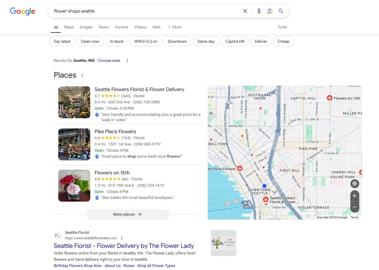
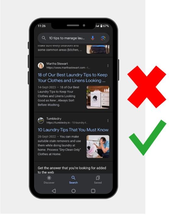
Desktop Search Results for “Flower Shops Seattle”
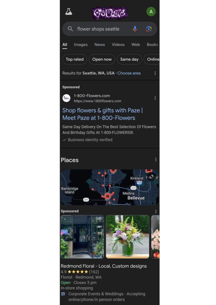
Look at these results. They are different from desktop results. Mobile users tend to skim and scan information. Mobile SEO focuses on concise, digestible content with visuals like images and videos. Desktop SEO can handle longer-form content.
Understanding user intent is crucial for any SEO strategy, but the way people search on mobile and desktop devices reveals some key differences. Mobile search behavior leans towards immediate needs. Users are often actively seeking a solution, formulating specific queries with a clear idea in mind. This translates to mobile SEO focusing on top positions. Since users are less likely to scroll on mobile, appearing at the very beginning of search results is vital for visibility.
In contrast, desktop searches offer a longer timeline for exploration. Users have the luxury of time to browse, discover new information, and ask more questions. This translates to desktop users scrolling down the page and potentially engaging with a wider range of results.
Mobile phones boast built-in GPS, providing search engines with precise location data to deliver relevant search results. Even without GPS, mobile devices can still transmit location information, impacting search outcomes. As a result, mobile search results are heavily optimized for user location.
Location data also plays a role in desktop searches, especially if the user is logged into a Google account across devices. However, Google prioritizes location information more heavily on mobile searches, influencing the type of results shown. For example, searching for a restaurant on a phone is more likely to yield a map result compared to a desktop search.
Mobile operating systems can also influence search results, particularly if a search query has app-oriented intent. In such cases, search engines might display app packs, providing a direct link to relevant apps within the app store. These app packs are only compatible with the user’s specific operating system (iOS or Android) and are not displayed on desktop searches.
Imagine you’re looking for something on your phone, like a new game or a budgeting app. Google wants to be super helpful and show you exactly what you need, right there on your phone. So, it pays attention to whether you’re searching from a fancy iPhone or a powerful Android. This way, Google can show you the perfect apps related to your search, instead of websites you’d need a computer for.
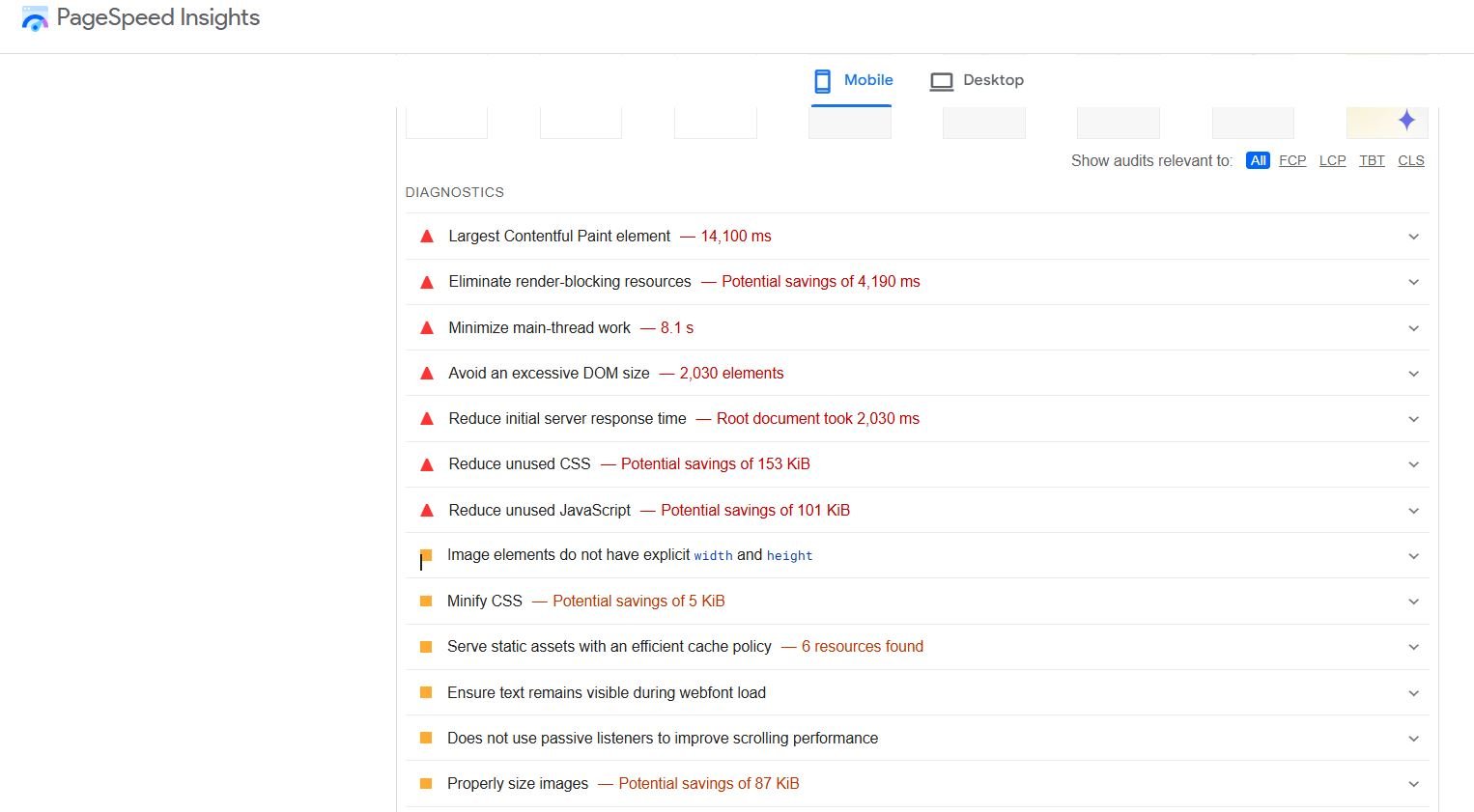
Websites speed on mobile devices can be improved by analyzing the page speed insights factors and optimizing them with proper techniques.
Navigating the digital landscape requires a finesse that speaks directly to your audience, especially when optimizing for mobile. The title and meta description of your website are more than just SEO elements; they are your first opportunity to engage mobile users. These critical components can determine whether someone decides to visit your site or scroll past. Therefore, creating titles and descriptions that resonate with mobile users is paramount.
Crafting these elements with sophistication means incorporating keywords that align with mobile search behaviors while maintaining brevity and relevance. Mobile screens offer limited real estate, emphasizing the need for concise yet compelling language that captures the essence of your content and invites clicks. It’s an artful balance of providing enough information to pique interest while leaving the audience wanting more.
This endeavor demands creativity and an understanding of your target audience’s needs and preferences. Tailor your titles and descriptions to address these aspects, employing language that connects and communicates the value of clicking through. In doing this, you not only optimize for search engines but also for the human element, ensuring that your first digital handshake with potential visitors is both memorable and inviting.
While the ideal character length can vary slightly depending on pixel width, here’s a general guideline:
By mastering the craft of optimizing titles and descriptions for mobile users, you lay the foundation for a mobile SEO strategy that not only ranks but resonates, setting the stage for meaningful engagements and conversions.
Diving into the world of Schema markup unlocks a new horizon of potential for your website’s visibility and performance in search results. This intricate yet powerful form of optimization involves embedding structured data into your site, acting as a beacon for search engines. It’s akin to providing a detailed map that guides search engines through the rich content landscape of your website, enabling them to grasp the context of your offerings more effectively.
By implementing Schema markup, you’re essentially enhancing the way your site communicates with search engines. It’s about speaking the language of the web more fluently, allowing your content to be showcased in rich snippets and knowledge graphs. This not only increases the real estate your website occupies on search engine results pages but also boosts the likelihood of click-throughs, as your listings are now enriched with information that directly appeals to users’ queries.
Imagine your website’s events, products, or articles standing out with ratings, price ranges, or availability directly in the search results. This is the power of Schema markup – it turns your search listings into compelling invitations to explore your site further. The sophisticated implementation of Schema not only catapults your mobile SEO efforts but elevates the user journey right from the search results, paving the way for increased engagement and conversions.
There isn’t a magic number of schema types for mobile SEO. Focus on using the schema markup that accurately reflects your content (e.g., product schema for e-commerce sites, event schema for event listings). Google loves websites with clear data markup, and that translates to a mobile-friendly experience too!
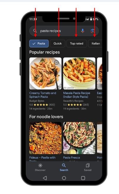
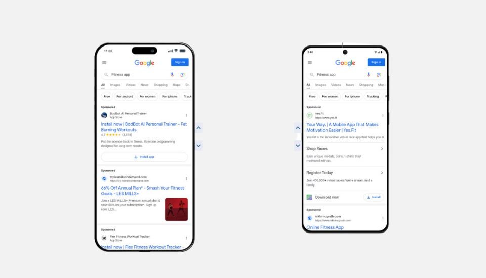
Mobile Results for Pasta Recipe where the blocks show options for different results.
Optimizing your website for mobile search goes hand-in-hand with clear communication to search engines. Schema markup provides a structured way to achieve this. Here’s a concise guide to generating schema markup specifically for mobile SEO:
By following these steps, you can generate effective schema markup that enhances your mobile SEO efforts and provides search engines with a clear understanding of your mobile content.
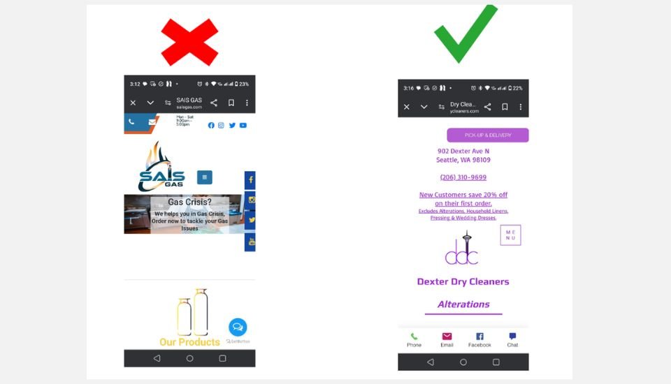
When it comes to mobile SEO, using pop-ups requires a delicate touch. On one hand, they can boost user engagement, but on the other, they can disrupt the user experience if overused. Let’s explore how to strike the right balance between catching attention and keeping things user-friendly.
To begin with, it’s crucial to think about when and why you’re using pop-ups. They should serve a clear purpose, adding value to what users are already doing on your site. For instance, offering helpful content, special deals, or important updates can enhance the user experience without getting in the way of their browsing.

The pop ups in above picture can increase the bounce rate and decrease the user engagement.
Timing is everything. Instead of bombarding users right away, consider triggering pop-ups based on their actions or after they’ve spent some time on your site. This way, the pop-ups feel like a natural part of their journey, not an annoying interruption.
When designing pop-ups for mobile, simplicity is key. They should look good and be easy to close on smaller screens. Responsive design principles ensure they fit well and don’t cause frustration, which can lead to users leaving your site.
Analyzing how users interact with pop-ups is vital for improvement. By studying the data, you can learn what works best for your audience and refine your approach accordingly. This data-driven strategy shows a commitment to providing a positive user experience.
In the end, using pop-ups strategically is a testament to understanding digital engagement. It shows that you care about both your business goals and your users’ needs. By finding the right balance, you can make sure your online presence leaves a lasting, positive impression.

The landscape of mobile SEO is intrinsically linked to the locality of your audience, making Local SEO an indispensable strategy for businesses aiming to capture the attention of mobile users within their vicinity. This focus on geographic specificity leverages the power of location-based searches, which are increasingly predominant amongst mobile users. They seek immediate, relevant solutions and experiences that are within their reach, literally and figuratively.
By intricately weaving location-based keywords into your digital content, and meticulously crafting a Google My Business profile that stands out, you position your brand not just on the map, but in the minds and devices of potential local customers. Ensuring your details are consistent across online directories further solidifies your presence, making your business a go-to option for those in proximity seeking your services or products.
This targeted approach does more than elevate your visibility; it fosters a sense of community and accessibility, bridging the digital gap between you and your local audience. It’s a strategic move that not only heightens engagement but also nurtures a relationship with your mobile-savvy customers, making Local SEO a cornerstone of a sophisticated mobile SEO strategy.

In the pursuit of optimizing your website for mobile users, it’s tempting to turn to plugins for a quick fix. However, this approach can inadvertently introduce challenges that compromise your site’s mobile-friendliness and, by extension, its SEO performance. The use of excessive plugins can lead to slower site speed—a critical factor in mobile user satisfaction and search engine rankings. Moreover, plugins can result in code bloat, adding unnecessary bulk to your site’s backend, which hampers its responsiveness and agility on mobile devices.
Furthermore, compatibility issues can arise, where plugins may not function as intended across all mobile platforms or browsers, leading to inconsistent user experiences. This scenario underscores the importance of adopting a more refined strategy that prioritizes manual optimizations and tailored solutions. Opting for custom coding or leveraging built-in CMS capabilities can significantly enhance your site’s mobile responsiveness without the drawbacks associated with plugin overdependence. Embracing this thoughtful approach aligns with a sophisticated mobile SEO strategy, ensuring your site remains nimble, engaging, and primed for search engine success.
The rise of voice-activated virtual assistants and smart speakers has given prominence to voice search. Mobile devices are often the primary platforms for voice searches, and optimizing for this trend is crucial for SEO success. Mobile SEO involves adapting content to match conversational queries and focusing on long-tail keywords that align with natural language patterns. Voice search optimization not only improves search engine rankings but also caters to the evolving search behavior of users.

Here’s how you can optimize your website for the age of vocal queries:
Optimizing for voice search isn’t just about ranking higher; it’s about understanding how users have fundamentally changed their search behavior. By speaking the user’s language and catering to their conversational queries, you can position your website as a trusted source in the age of voice.
Page loading speed is a crucial factor in both user experience and search engine rankings. Accelerated Mobile Pages (AMP) is an open-source initiative that aims to improve the loading speed of web pages on mobile devices. By implementing AMP, websites can deliver content more swiftly, resulting in reduced bounce rates and improved search rankings. Google, in particular, favors websites that adopt AMP, making it an important consideration for mobile SEO strategies.

The importance of mobile SEO cannot be overstated. With mobile devices dominating internet usage, businesses and website owners must prioritize mobile optimization to ensure a seamless user experience, maintain search engine visibility, and stay ahead of the competition. Incorporating mobile SEO strategies, such as responsive design, local optimization, and voice search considerations, is not just a recommendation; it is a necessity for sustained online success in the mobile-centric world we live in.

Gone are the days of web experiences confined to a rigid desktop frame. In today’s mobile-first world, users expect content to dance across their screens, adapting flawlessly to any device. This is where the fluid layout emerges as a game-changer.
Imagine a website that breathes. A website where elements resize and rearrange themselves like a responsive organism, ensuring a perfect fit on any screen, from a pocket-sized smartphone to a sprawling tablet. That’s the magic of a fluid layout.
Here’s why it matters:
Effortless User Experience: No more zooming, pinching, or awkward scrolling. A fluid layout ensures everything from text to images adapts seamlessly, creating an intuitive and frustration-free experience for mobile users.